Design Systems
Design Systems in the left menu, at spoken.systems/host/dashboard/design-systems.
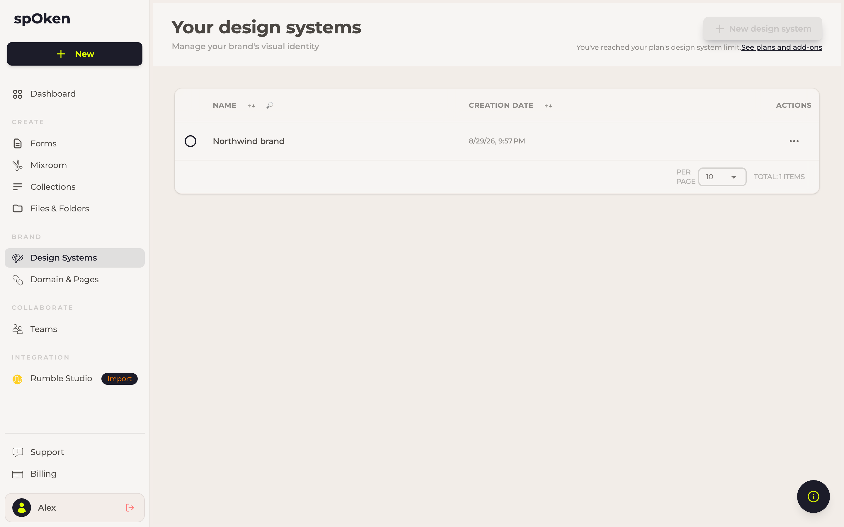
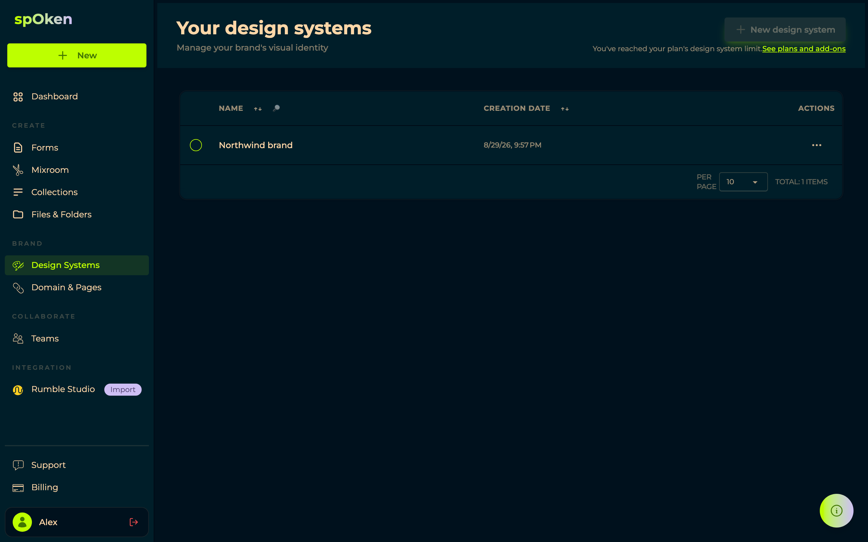
A design system is a saved set of visual decisions — colours, fonts, the treatment of buttons and cards — that a form or a page can adopt instead of being styled one by one.
The editor


System Name and Usage are on the left, above Quick Actions — + Color, + Palette, + Font, + Image — which are shortcuts to the three sections on the right:
- Colors, grouped into palettes. Each colour has a name of its own, so a form refers to Ink or Signal rather than to a hex code, and changing the value moves everything at once.
- Typography, where + Add Font adds a face with its family, size and source.
- Media Assets, for logos and artwork — Upload a new file or Browse the ones you have.
Usage tells you where the system is in use, which is what makes editing one safe: you can see what will change before you change it.
Attaching it
Attach one from a form's Global Design panel (the right-hand pane of the form builder with no step selected). Change the design system later and everything using it follows.