Forms
The forms list — Forms in the left menu, at spoken.systems/host/dashboard/forms — is where a project starts. Each row is a form.


Watch it once
Fifty seconds, no sound: a form made from nothing, three steps added, opened to the world and its link copied. Subtitles are on by default.
Making one
New Form, top right, creates one and opens it. Clicking a row opens that form's builder.
The table sorts and searches from its own header: ↑↓ next to title, Last update and creation date sorts by that column, and 🔎 next to title opens a search box that filters the list as you type.
The row menu
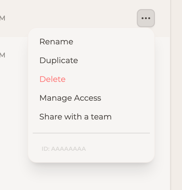
The ⋯ button at the end of a row:
| Item | What it does |
|---|---|
| Rename | Changes the form's title. |
| Duplicate | Makes a copy of the form. It asks for a name, offering <title> (copy). |
| Delete | Removes the form. |
| Manage Access | Opens the access list — the same one as Sharing below. |
| Share with a team | Grants the whole team access in one step. |
A duplicate carries the questions, their order, the theming and the design systems, and it points at the same uploaded media as the original — so it opens looking finished, ready to be edited into whatever you needed a second version for.
Three things stay behind. Responses: a copy starts empty, and the original keeps every answer it had. Sharing: whoever duplicates owns the copy alone, so duplicating a form someone shared with you does not hand them your version. And the edit history, which described steps the copy no longer has.
Forms are not archived — responses are
There is no archive on a form: a form you no longer want either stays (unread rows cost nothing) or is deleted. Archiving applies to individual responses.
The builder


The top bar


On the left, the house icon and Form Editor go back to the list, and the form's title next to it — with the pencil — renames it.
In the middle, four tabs:
| Tab | What it is for |
|---|---|
| Design Studio | Build the form: steps, their content, and how it looks. |
| Responses | Everything respondents have sent, one row each. See Responses. |
| Sharing & Integrations | Public access, the link, the embed, and who on your side can see the form. |
| Help | Guidance on the step types, in place. |
On the right, three actions:
- The door icon opens the live form in a new tab — the real thing, exactly as a respondent gets it, not a preview.
- Preview (the eye) shows the form inside the builder, without leaving it.
- Share opens a short menu.
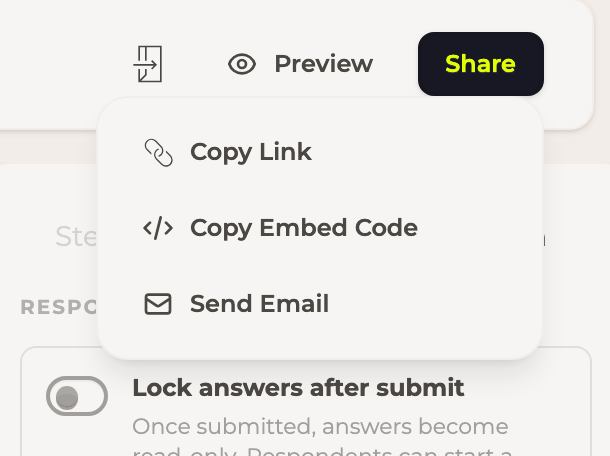
Copy Link puts the public address on the clipboard, Copy Embed Code the <iframe> snippet
for your own site, and Send Email opens your mail client with the link already written.
Design Studio
Three panes: the step list on the left, the canvas in the middle showing the step as respondents will see it, and the properties panel on the right.
- Add New Step, under the step list, opens the step-type menu and appends the one you pick before the closing screen. The small + between two steps inserts one there instead.
- Steps reorder by dragging the handle, and delete from the × on the step.
- The ‹ button at the top of the step list collapses the pane to icons.
- Above the canvas, a selector sets the aspect ratio the canvas is drawn at (a phone, a desktop), and Toggle Light/Dark Mode previews the form in the other palette.
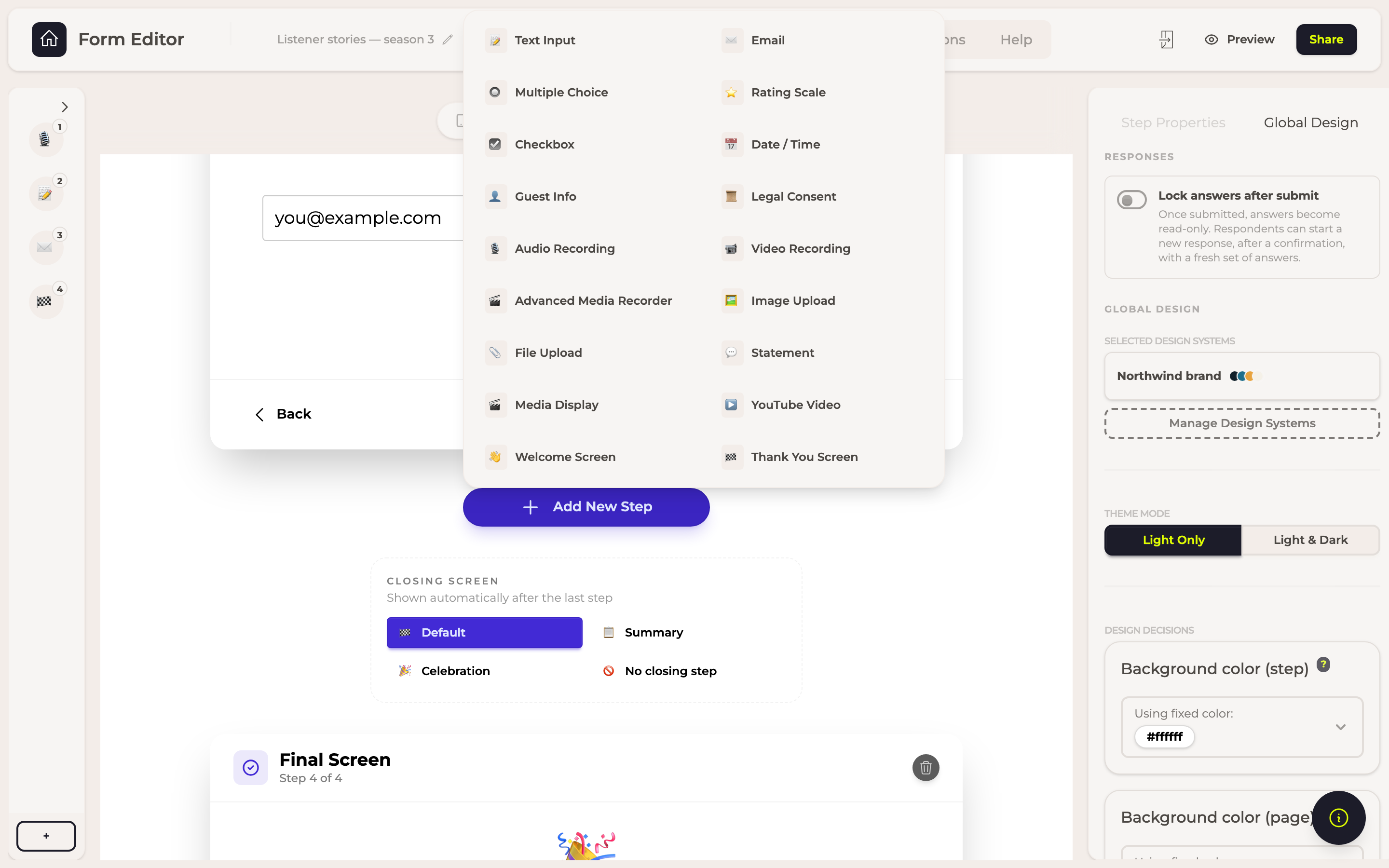
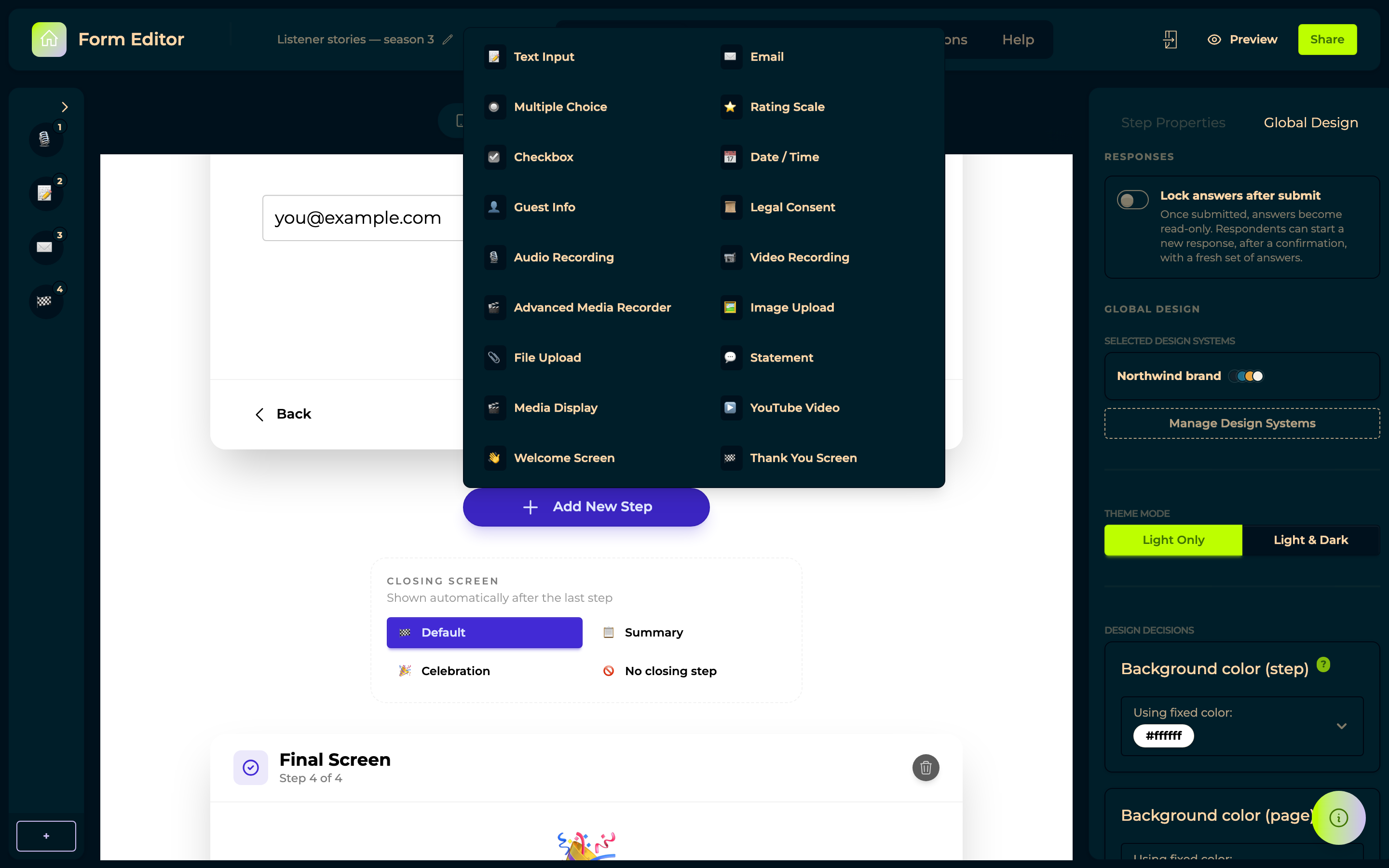
The properties panel has two tabs. Step Properties edits the selected step — its question, and whatever else that step type offers. Global Design applies to the whole form:
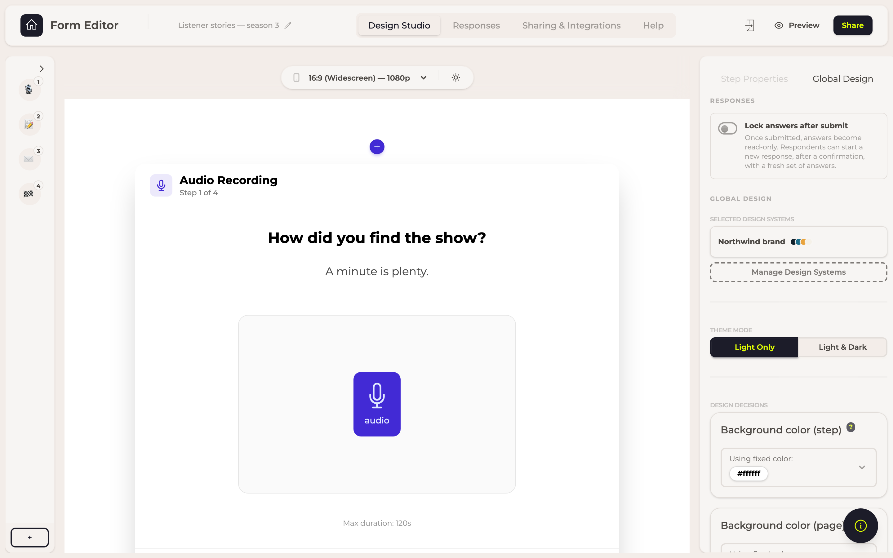
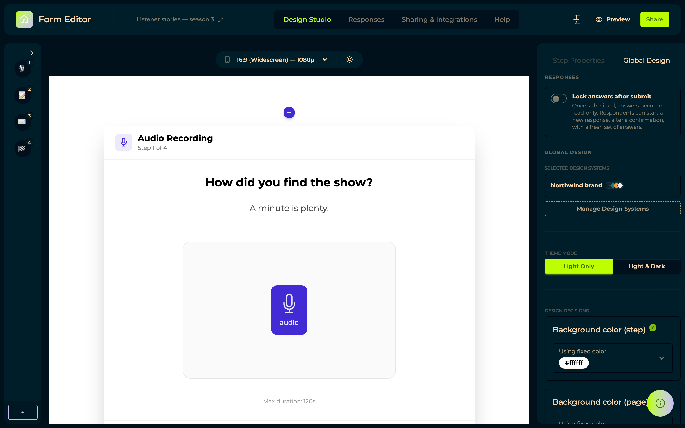
| Setting | What it does |
|---|---|
| Lock answers after submit | Answers become read-only once submitted; the respondent can start again with a fresh set, after a confirmation. |
| Selected Design Systems | Attaches a design system, so the form takes your colours and fonts. Manage Design Systems goes there to edit them. |
| Theme Mode / Editing Mode | Whether the form offers light and dark, and which one you are editing. |
| Design Decisions | The form's own colours, when you want to override the design system for this one. |
Locking needs a closing screen
Answers reach you as they are given, step by step — a respondent who closes the tab has already sent you everything they filled in, whatever the form ends with. Nothing is waiting on a button.
What the closing screen's button adds is the moment of submission, and that is only what Lock answers after submit needs: without a closing screen there is nothing to press, so answers never become final and the setting has no effect. The panel says so, and offers Add a closing screen on the spot.
Sharing & Integrations
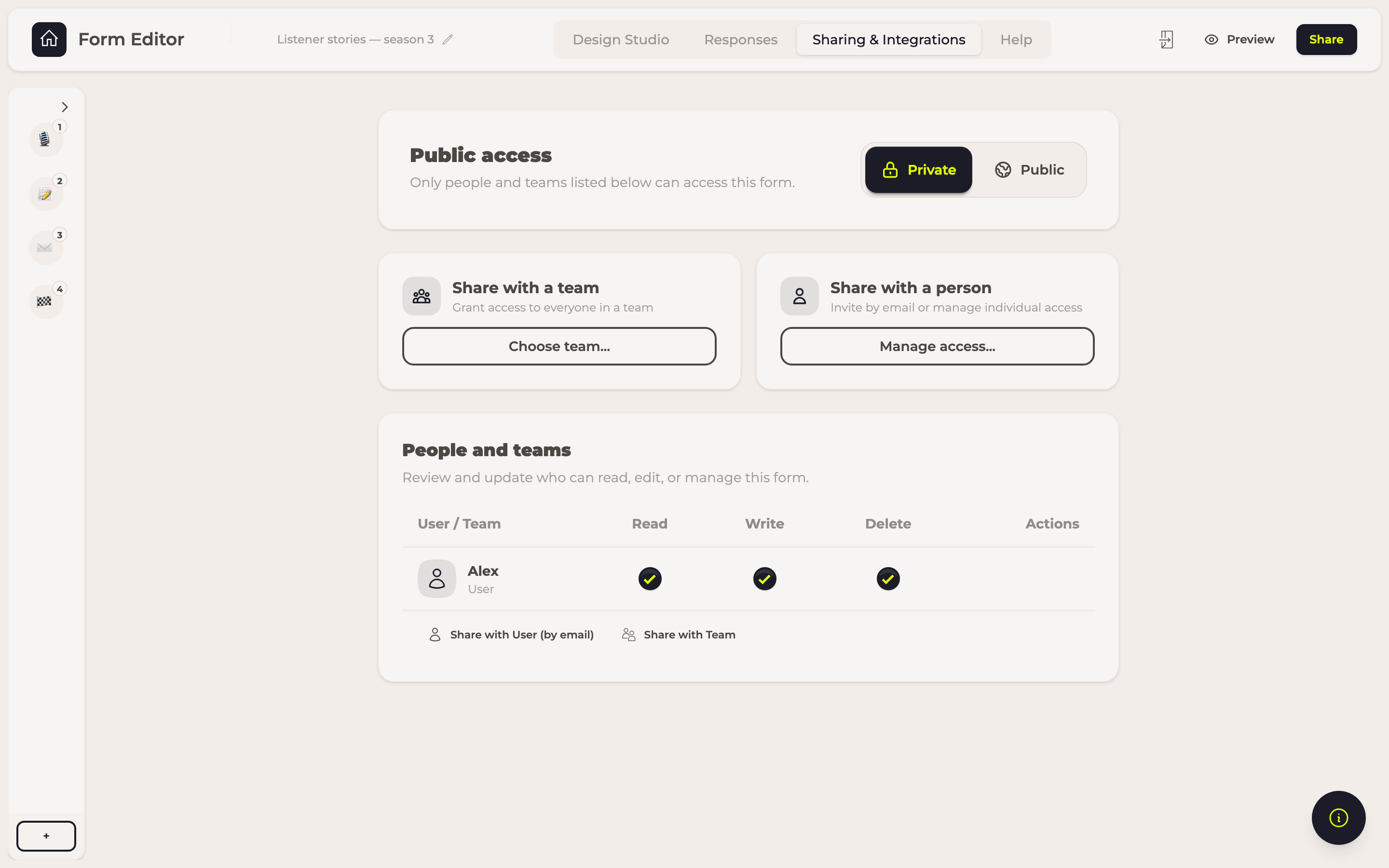
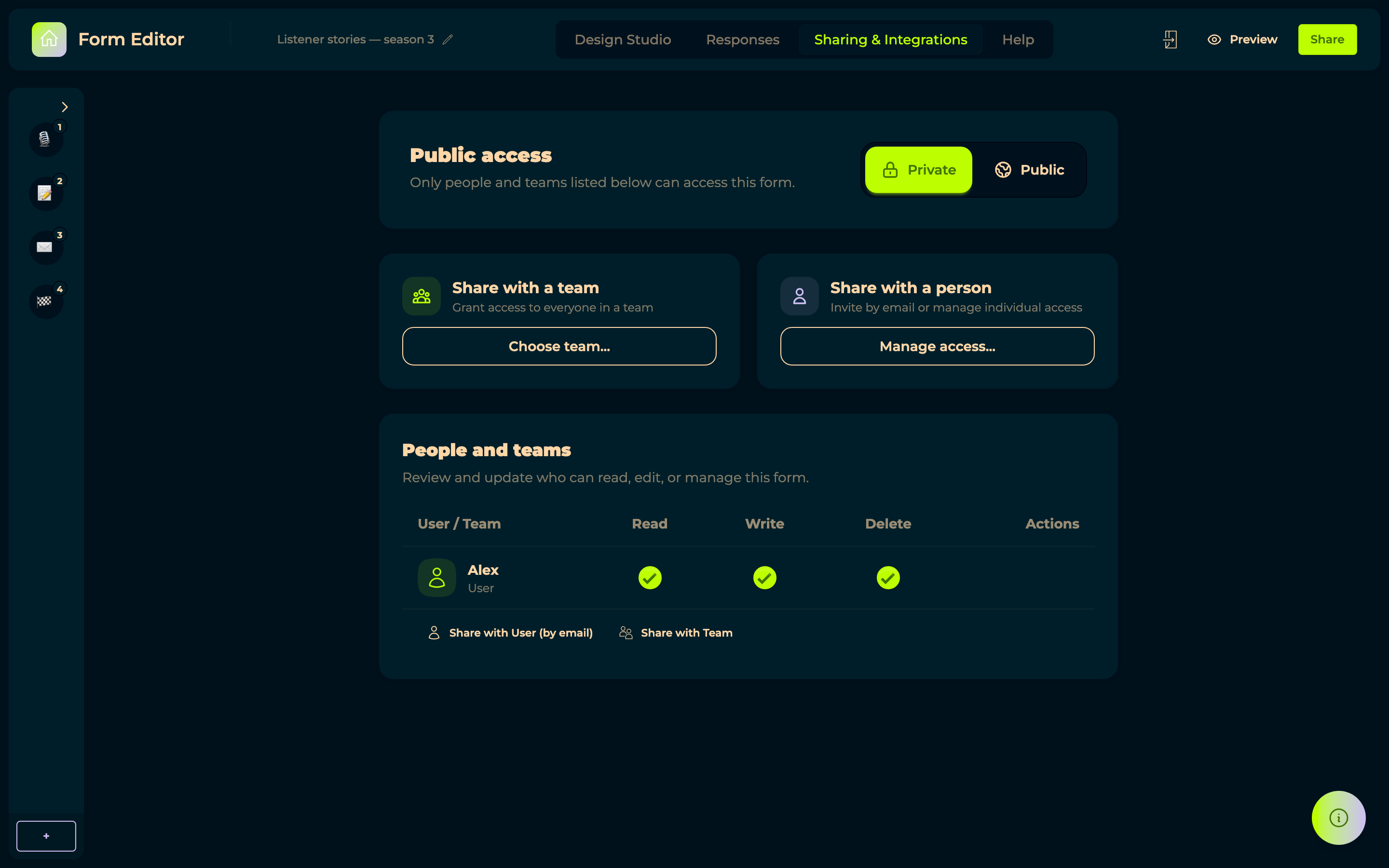
Public access is the switch that matters: Public means anyone with the link can fill the form in, no account needed — which is the normal way to use spOken. Private limits it to the people and teams listed underneath.
While it is public, the tab also shows the link with a Copy link button, a QR Code you can Print / Download for a poster or a business card, and the Embed on website snippet with Copy embed code.
The snippet carries the permission an embedded form needs to reach the microphone. A browser grants that to an embedded page only when the site embedding it says so, which is why the attribute is part of the snippet rather than something to add yourself. If a form embedded on your own site cannot find the microphone — while the same form works when opened directly on spOken — the page is running an older snippet: copy it again and replace the one on your site.
Below that, access on your own side:
- Share with a team → Choose team... grants everyone in a team access at once.
- Share with a person → Manage access... invites someone by email.
- People and teams lists everyone who has access, and whether they can read, edit or manage it.